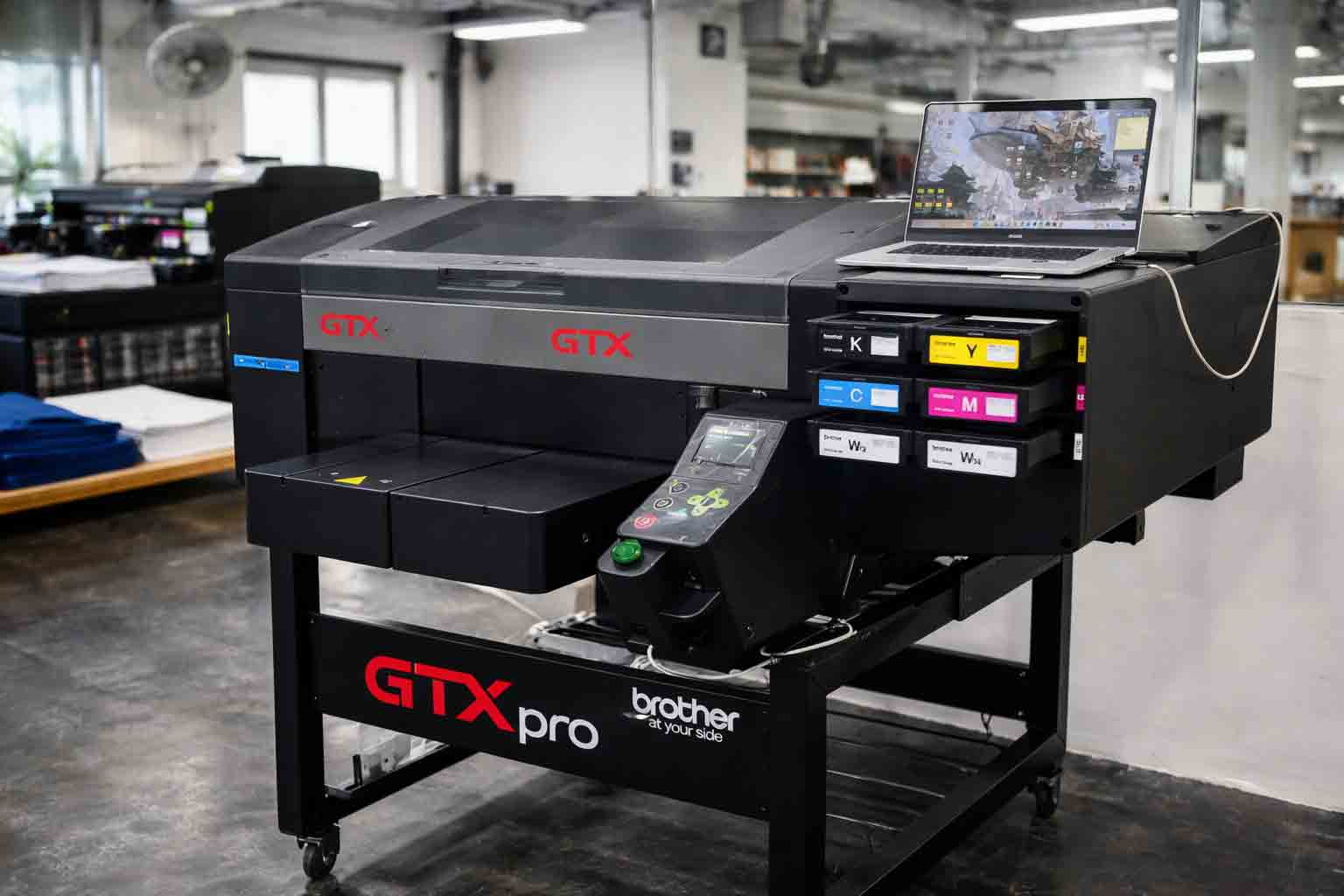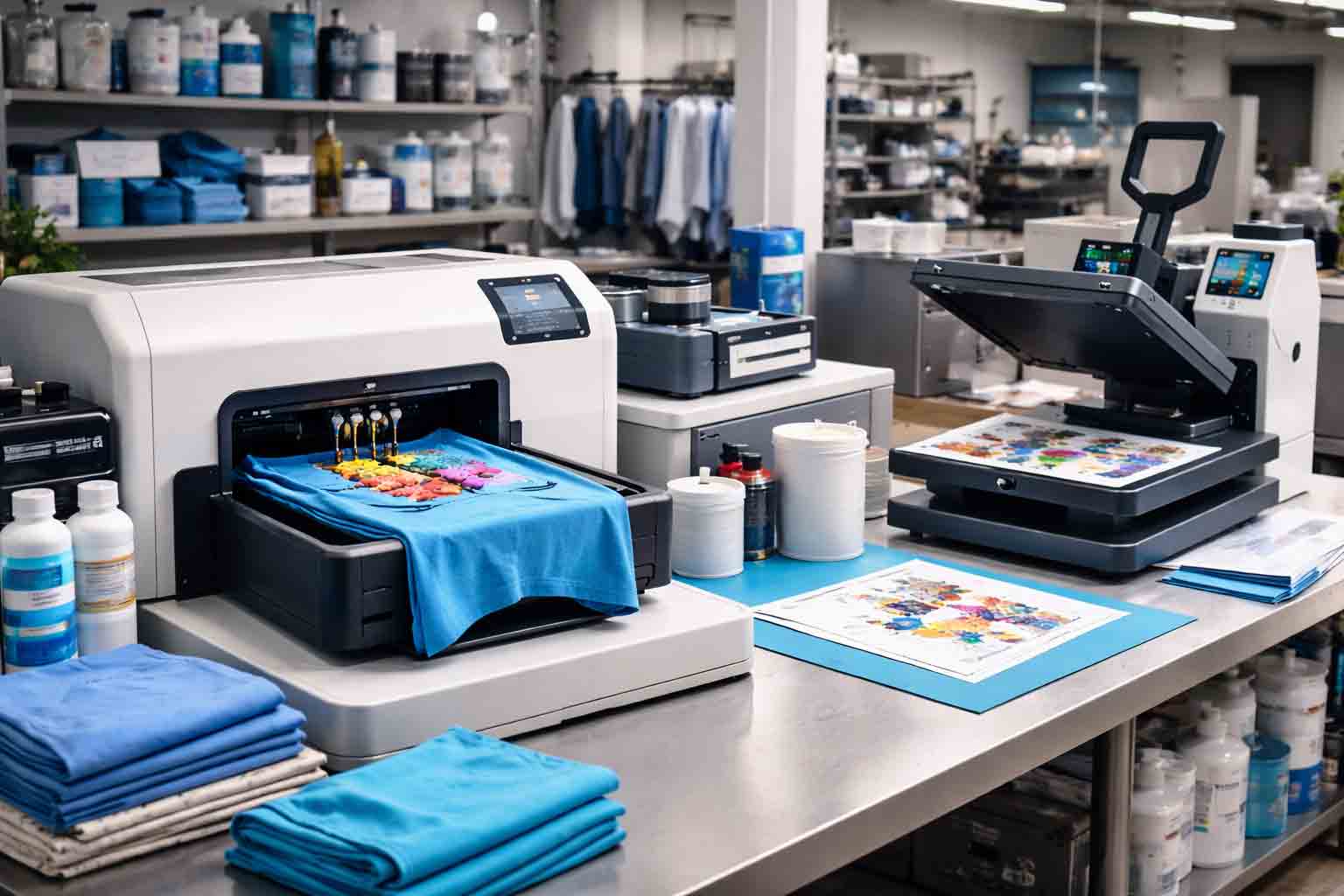
DTG vs DTF
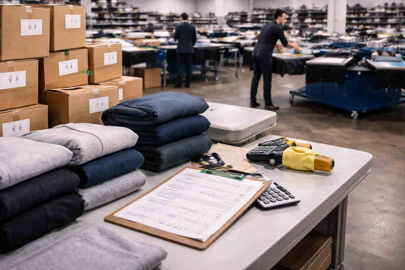
Choosing a print method can make or break your merch drop. The “right” option depends on fabric type, artwork style, order volume, and the feel you want in hand. Fabrikk helps brands pick a method that stays consistent at scale—so your prints look premium and your customers come back for more.
What you’re really comparing: ink in the fabric vs. film on top
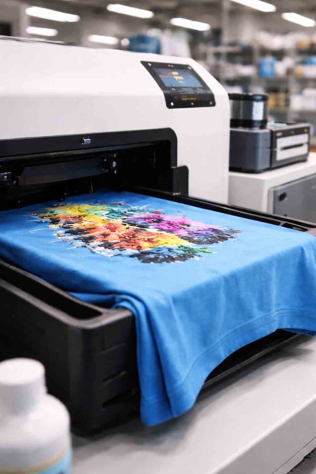
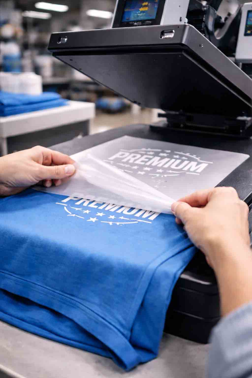
Here’s the core difference in plain English. DTG (Direct-to-Garment) prints ink straight into the fibers—best on cotton, great for soft, “part of the shirt” results. DTF (Direct-to-Film) prints onto a film, adds adhesive powder, then heat-presses the design onto the garment—super versatile across materials and often more forgiving for mixed fabrics.
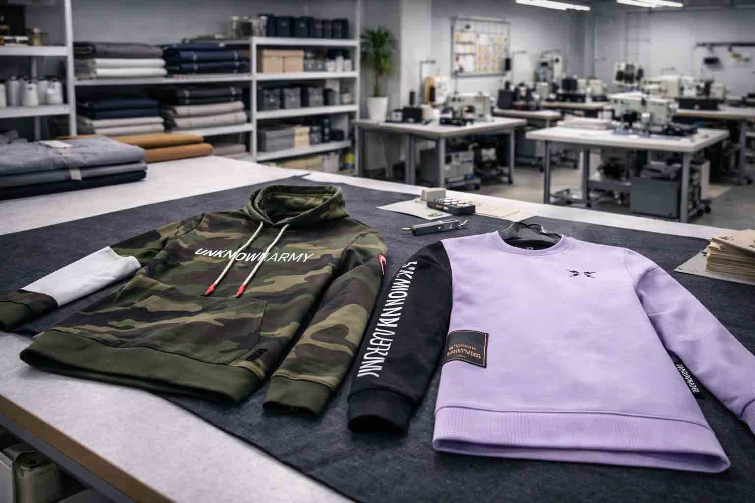
When customers judge a print, they feel three things fast: softness, stretch, and how “solid” the graphic sits on the fabric. That’s why the production choice should match your product goal (everyday wear, heavy streetwear, team uniforms, event tees, or gift-quality merch).
When DTG shines: soft prints, fine detail, and cotton-first collections
DTG is a strong fit when you want a soft hand-feel and detailed, full-color artwork on cotton garments. It’s popular for premium tees and hoodies where comfort matters, and for designs with subtle gradients or lots of small color transitions.
Where DTG can struggle is on certain blends, on very dark garments without proper pretreatment, or when you need extreme durability on tough workwear. The solution isn’t “avoid DTG”—it’s setting the right expectations: the right garment base, proper pretreat, correct curing, and quality checks that keep prints consistent from run to run.
Hands-on tip: if your brand sells “everyday premium,” start with high-quality cotton blanks and tune your artwork for softness (avoid huge solid blocks when you want the print to disappear into the fabric).
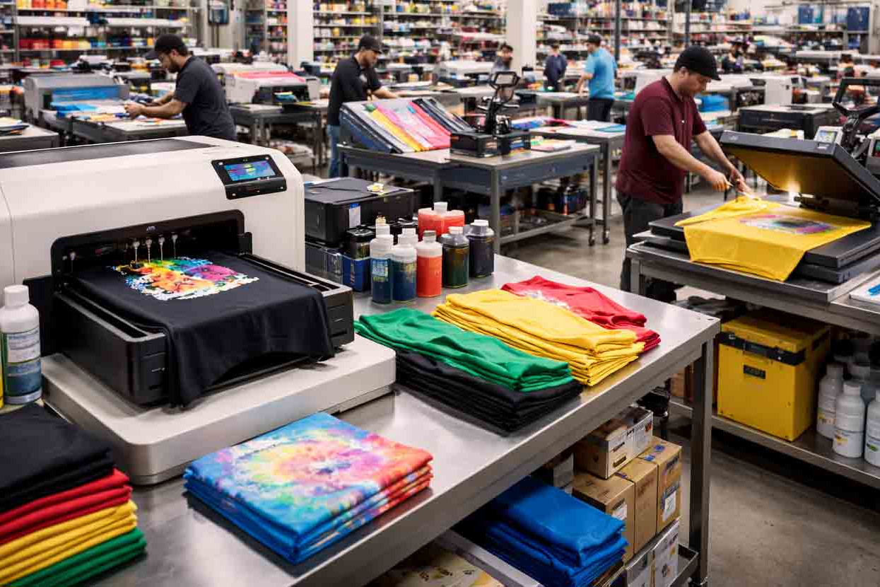
When DTF wins: versatility, punchy color, and mixed-fabric demand
DTF is often the practical choice when you need consistent results across different materials—cotton, polyester, blends, and performance fabrics. It can deliver punchy color and crisp edges, which helps for logos, bold graphics, and designs that need to pop from a distance.
The trade-off is feel. Because a transfer layer sits on top of the fabric, large designs can feel more “present” in hand. Great production minimizes that with smart artwork choices (clean shapes, good negative space) and correct pressing settings so the graphic stays flexible instead of stiff.
Durability, wash testing, and what customers actually notice
Most buyers don’t talk about curing temperatures or pretreat formulas—they talk about cracking, fading, and peeling after washes. That’s why a real merch program includes wash testing and clear quality checkpoints. A “perfect” print on day one isn’t the goal; a print that still looks sharp after many wears is.
A smart approach is to match durability expectations to product use. For example: event shirts may prioritize speed and bold visibility, while premium streetwear focuses on hand-feel and long-term wear. For general background on textile printing methods, you can reference this overview: Textile printing (overview).
How Fabrikk helps you pick the best method for your merch goals
In real life, the best method is the one that stays consistent at your scale, on your garment types, and with your artwork style. Fabrikk helps brands make the decision commercially: not just “what looks good,” but what stays reliable when you reorder, expand sizes, or add new colorways.
What brands typically need most:
- Clear recommendation per product: tees vs hoodies vs performance items.
- Artwork readiness: files prepared for clean results and fewer surprises.
- Premium finishing: results that feel intentional, not like a quick promo print.
- Repeatable quality: settings and checks that hold up over time.
That means fewer returns, fewer unhappy customers, and a collection you can scale with confidence.
Print decision checklist: choose fast, choose smart
Use this checklist to make a quick, practical decision—without getting lost in technical jargon.
- What fabric are you printing on (100% cotton, poly, or blends)?
- Is the garment light or dark, and do you need strong opacity?
- Do you want the softest possible hand-feel, or maximum versatility?
- Is the design photo-style with gradients, or bold and logo-heavy?
- How large is the graphic (small chest mark vs full-front coverage)?
- Will you reorder often (consistency matters more than “one perfect batch”)?
- What’s the end use: fashion, workwear, events, gifting, team uniforms?
- Do you need strong stretch and flexibility for activewear fabrics?
- Have you tested wash durability on the exact garment base?
- Is your artwork prepared correctly (resolution, color profile, transparency)?
- Do you have QC checkpoints (alignment, curing/press settings, final inspection)?
- Will the final product still feel premium in hand when the customer opens it?
If you can answer these clearly, the method choice becomes simple—and your production becomes more predictable.
FAQ: common printing questions (clear answers)
DTG often feels softer on cotton because ink penetrates fibers. DTF can feel more “on top” depending on design size and pressing settings.
DTF is typically more versatile across polyester and blends. DTG is strongest on cotton-first garments and requires careful setup on darker items.
Both can be durable when done correctly. Longevity depends on garment quality, prep, curing/press settings, and wash testing—not only the method.
DTF often delivers strong opacity and vivid color across more fabric types. DTG can look excellent on cotton when properly pretreat and cure are dialed in.
Yes. Large solid areas feel heavier—especially with transfers. Smart artwork (negative space, smaller placements) keeps prints feeling premium.
DTG is often great for photo-like gradients on cotton. DTF can also handle detail well, especially for crisp edges and strong opacity.
Common causes include wrong curing/press settings, poor adhesion, low-quality film/ink, incorrect washing, or printing on unsuitable fabric.
Use consistent garment blanks, keep artwork specs standardized, run wash tests, and implement QC checks for alignment, finish, and durability.
It depends on setup, garment type, and complexity. The cheapest print isn’t always the best value if it increases returns or hurts perceived quality.
Both can work. For a softer fashion feel on cotton-heavy hoodies, DTG can shine. For consistent results across blends and bold logos, DTF is often practical.
Use high-resolution files, correct transparency, and clean edges. Avoid tiny details if your garment texture is heavy (like fleece) unless tested.
Decide based on garment fabric, desired hand-feel, and how repeatable the process will be for reorders. Sampling plus wash testing removes most uncertainty.
Wrap-up: pick the method that scales with your brand
The best print choice is the one that matches your fabric, your artwork, and your promise to customers—then stays consistent when you grow. With Fabrikk, you get a practical setup that protects quality, keeps production predictable, and helps your merch feel premium from first drop to reorders.